Journal of
eISSN: 2574-8114


Research Article Volume 4 Issue 1
Department of Applied Design, Appalachian State University, USA
Correspondence: David Domermuth, Department of Applied Design, Appalachian State University, Boone, NC 28607, USA, Tel 8289641183
Received: December 09, 2017 | Published: February 1, 2018
Citation: Domermuth D, Cook M, Ghamari H. Understanding visceral design. J Textile Eng Fashion Technol. 2018;4(1):61-64. DOI: 10.15406/jteft.2018.04.00122
Is it possible to quantify good art? Many sources say no. This paper tackles a tougher problem, the characterization of visceral design. People have a feeling about good design and an instinctive reaction to visceral design. Why? Can it be taught, learned, and the rules used to create more appealing product? The basic concepts of art and design are reviewed followed by an objective classification of visceral factors.
This study also considers interior design, industrial design, and apparel design to identify their nature and design problems. Each discipline is investigated to identify common grounds in order to define the rules of visceral design. Topics for this paper include the golden ratio, proportion, repetition of form, analysis of patterns, and color theory.
Marketers often use sex appeal as a means of attracting attention and implying a boost to one’s self esteem via the sales display or use of one item compared to another. “Visceral design refers primarily to that initial impact”, Malcolm Sayer’s 1960s Jaguar E-type, “Streamlined and provocatively phallic form tapped into the psyche of a generation”, Paul Rodgers.1 Visceral design is a subset of emotional design, how we respond to a product or space in terms of look, feel, and pleasure-giving. Sigmund Freud proposed a psychosexual analysis to explain human behavior which was a dominant influence in the twentieth century. Richard Buchanan (1992) indicated that despite efforts to discover the foundations of design thinking in the fine arts, the natural sciences, or social sciences, design eludes reduction and remains a surprisingly flexible activity. No single definition of design sufficiently covers the diversity of ideas and methods of design thinking and execution. Most people would agree that human’s sexuality has a significant influence in daily lives. And designers can stretch this to a probable influence for choice of items and spaces, I.E Visceral or Sexy Design; and use this to promote product and satisfy the customer. This paper is an attempt at explaining and quantifying what people perceive as visceral/sexy in product and spaces. The term sexy is often used by designers to indicate excitement. “It is too boring, make it more sexy” So for most of this paper “sexy” is used to imply a visceral reaction.
Industrial design and product perspective
There are a number of principles that have to be followed for objects, spaces, or apparel to be considered good design. The first of these is repetition of form. The human eye and soul enjoy consistency of features such as similar curves or angles. Too much variation is usually perceived as chaotic and unsettling. An elegant design will definitely have consistent form, but elegance doesn’t have to be sexy. A design can definitely be elegant and boring, tasteful but dull; so sometimes features that push a design towards sexy will violate the rules of consistency of form.
A similar analysis can be made for patterns. Which patterns are elegant and which tend towards sexy? How do strips compare with plaids, polka dots with curves? Color theory is a well-developed science with a strong correlation to sexual stimulation, I.E. red and black. The Golden ratio can be incorporated into design to help make an object aesthetically pleasing but the inclusion doesn’t necessarily make it sexy. The Golden ratio is a mathematical relationship between two objects (or a single object that can be split into two objects, like the golden rectangle), with a relationship of 1.6180.2
The simplest example of this paradigm is a person’s face. It is usually not a person’s face that appears sexy but the expression. Two faces one fitting the golden ratio and one not, one face with a wink or come on smile and the other relaxed, which is sexier? Also makeup, lipstick and eye shadow will extenuate the sexier features of the face. The same is true for objects the additions of sexy form elements like curves, color, or a sleek wet look are sexier then not and will outweigh simply meeting the golden ratio. But the inclusion of both meeting the golden ratio and including sexy features wins every time.
Proportional design is definitely a requirement for sexy. This is a similar observation to the golden ratio but more general. Here again the human body is an easy example. Any Walt Disney animated movies are prime. What facial characteristics are always exaggerated for the female leads? The eyes are huge and dreamy, the mouth is usually large, waist, small, hips wide. The male characters have huge shoulders, broad forehead and a strong chin. The extension of this with products is easiest to observe in bottles and cars. Sexy bottles incorporate exaggerated but sensual curves or the classic hour glass of a coke. Cars are more complicated; sleek, streamlined, but can have exaggerated rear ends, large fenders, and tires.
Apparel design and clothing perspective
For Apparel, it’s accepted by most historians that humans wear clothing first for adornment. Humans have a natural desire to look attractive, look sexy. Of course there is the need for function in the form of protection or to serve some functional purpose in survival or life activities. But even when clothing and textiles satisfy a functional need, humans tend to want it to also look attractive. Designers and product developers strive constantly to add the sexy factor(s) to function, for even the most mundane products and especially to the most luxurious. Adding desirability beyond function is stimulating to the senses, causing physical reaction, and emotional reaction, symbolic connections that may be conscious or unconscious. These reactions formulate deep within, coming from a combination of life experiences, learned response, genetic predisposition, and desire to fit within a societal confine.
Aesthetic considerations for apparel have a complicating factor - the human body. A great looking suit can be appreciated for its detailing in the seams, in the form, by the texture of the materials used, by the color, and so many aesthetic combinations. However, judging that suit’s desirability when it’s lying on a table, across a chair, or on a hanger can be very different from judging its look when a person is wearing it. That’s not to say that the suit cannot look sexy and attractive when viewed alone. It can be extremely desirable and sometimes more so when removed from the human body perspective. The wearing of the garment is an additional factor that can enhance or can cloud the issue.
The idea of the Golden Ratio and its link to perceived attractiveness can be applied to apparel products whether on the body or on their own. However, there can be the complication of if the wearer is perceived as very attractive it can increase or skew the attractiveness of the product, despite the stand alone aesthetic characteristics. It is often said that some body types can wear anything or when a person is considered particularly handsome or beautiful that they look good wearing anything. Factors of how the product enhances the body or the body enhances the product can cloud the issue of attraction. It is possible for a person to look better in their clothes than out of them. It is possible for aesthetic characteristics of an apparel product to enhance the attractiveness of the wearer. That enhanced attractiveness can stem from physical, symbolic, or emotional design elements within the product. For example, if viewed by a cultural group that considers the bare shoulder to be alluring, then in most cases an exposed area of shoulder in the garment design might attract attention to the wearer. In that same cultural group perhaps showing a bare shoulder has additional symbolic meaning of availability, or by exposing an area of the body considered alluring it gives the emotional boost to the wearer of feeling more attractive. The shifting of human body ideals over time mixed with the variation of different ideals within different societies and cultures has a powerful impact.
It is often observed that there can be a very fine line between “sexy” and “trashy”. Design principles of light reflection and texture often play a major role in that determination with apparel products. Use of shiny, wet look materials can immediately add a visceral factor just as waxing a car to its shiniest makes it more attractive than the one covered with road dust, or upholstering a chair with an unexpected shiny or textural fabric can make that chair stand out from all the others. Wearing a soft looking, fuzzy sweater might lure others to want to touch that sweater. It’s an emotional reaction that is hard to suppress. The right kind of soft looking, fuzzy material also on the seats of the car or the seat of the chair will make a person want to sink into that softness and enjoy what is expected to be comfort and pleasure. Unfortunately, if the look doesn’t match the function of that material actually feeling soft and pleasurable to the touch, there is a moment of conflict while the brain reconciles these differences. The sexy factor can diminish quickly from the time the brain thinks it has seen a product and the time that product is experienced physically.
The conflict of reconciling perceived versus actual in apparel design relates to other concepts. A suit can have the most beautiful contours, material texture, and precise construction, but if too tight in the wrong places, those attractive features are diminished when the wearer’s brain factors in fit. Statistically, apparel consumption trends in the USA show that humans struggle with that reconciliation. People constantly buy and wear apparel that has poor fit. The reasons are many, but often this is a combination of how the wearer wants to look to increase attractiveness or give off signals about status and personality mixed with how they see themselves.
Along with the question of controlled body exposure as a factor of sexy design, we have the design principle of proportion in general playing a large role here, not just the proportional concepts. When shopping for apparel, consumers will often say they can’t wear certain design styles due to their body proportions. While that can be true to some degree that some styles are better suited to certain body types, it is most often the case that a change of proportions of almost any style can make that style increase in attractiveness. It is the correct proportional fit that makes the difference and controls the aesthetic judgement of the viewer and the wearer of the product.
The relationship of novelty versus complexity has a powerful impact. Novelty within a design excites the brain and holds the brain’s interest. It’s a kind of brain tease. The brain is attempting to reconcile, understand, and come to a comfortable conclusion about what is being sensed. However, if the novelty is too great it results in too much complexity. Some complexity for a shorter time can be exciting, but if it lasts too long or is too intense it becomes overwhelming and annoying, frustrating. The concept of order mixed in can help or agitate further. A novel design that has some repetition of line for example can help create a sense of order that may work with the novelty and reduce the perceived complexity. There is an inverted-U relationship of novelty and pleasure where novelty at a medium level results in higher levels of pleasure. Fiore3 (Fiore cites (Walker, 1980) on this concept) When the novelty is overused the look goes from sexy to trashy.
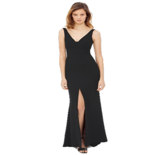
Color is a powerful tool in apparel product design just as it is for other product categories. A little black dress, a Dior red evening gown, red lipstick on voluptuous lips, red polish on the nails, pink blush on the cheeks (enhanced or natural) - these are all very attractive, unless they are overdone. Is it too much of a good thing adding up to bad thing? The effect of lighting and reflection of these colors mixed with perceived shine versus matte finishes plays an important role too. The color red stimulates physiological reaction in humans and is linked to sexual attraction indicators. Red with a shine finish can be even more exciting. The same red in a dull finish may not read as sexy the way the shiny finish might. But color plays with perceptions of proportion. The exact same dress made in white, then also constructed in red might be perceived as smaller or larger due to the color. The same dress in textured white cotton that absorbs the light and does not reflect versus that same dress in white silk satin which will reflect the light may be perceived to be different sizes.
Other design elements that have a particularly strong effect on perceived attractiveness and pleasure include movement (both perceived and actual) and sound. Textile print patterns that stimulate the eye and brain causing optical illusions of movement can transport a product covered with that print from novel, exciting, interesting, to nauseating (literally) for some observers. The principles of order and repetition, along with continuation of line and curve with a design all work together to balance the perceived overall effect and judgement of if it is sexy design. Sound can enhance or completely change that perception. The sound of leather squeaking every time the product moves can negate the sexy look. The wind blowing over a windbreaker style jacket and causing that innovative new wind blocking material to crackle near the wearer’s ear can negate the sexy look. Determining sexy design will mean defining how completely humans interact with that design from the perspective of all five senses. If we’re only evaluating from a distance and admiring afar, then the sound might not matter at that point.
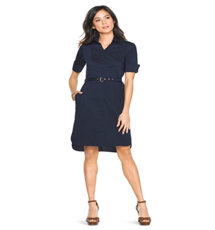
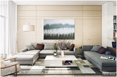
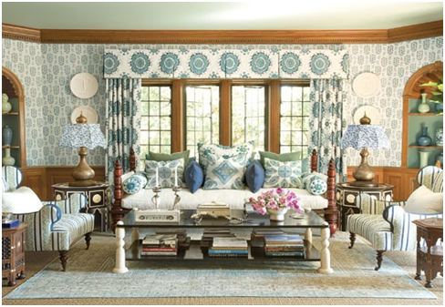
The method for investigation sexy design is by contrast. First, what is sexy design compared to what isn’t sexy design. Second, what is the difference and what elements for features distinguish sexy from not; and finally, can the features be quantified? The features include color, shape, and texture. The contrasting set of emotional responses include the effect of humor, fun, somber/sad, elegance, dignified, expensive, elaborate, and so forth. The experiment is to take an abject like a chair and then modify its features to push it towards an emotional reaction and note the effect. For instance, almost any product that is blood red will elicit a sexual response. Jumping to conclusions the response of red can be associating with people blushing to reveal a sexual attraction. In the same vain flat black is usually a somber feature but shiny black can be sexy. Why a wet look is usually sexy? Bookcases are seldom considered sexy but cars often are. Any plain brown rectangular bookcase is not sexy but with the addition of glass and chrome designer will call it sexy, or classify it sexier than the plain brown (Figures 1-6).4‒6


None.
Author declares there is no conflict of interest in publishing the article.

©2018 Domermuth, et al. This is an open access article distributed under the terms of the, which permits unrestricted use, distribution, and build upon your work non-commercially.