The persisting alert status required by the recent epidemic Covid-19 virus all over the world, has stimulated the necessity of investigating new medical therapies to face the epidemic and evidenced the usefulness of predicting somehow the widespread of the infection process in the territories. The latter aspect, although having prevalent non-medical character, has relevant social interest to program in advance and organize financial interventions by the local health Institutions. For this reason, has been carried out the present statistical study on the number
of infected individuals as a function of time and related consequences in Italy. The basic questions that motivated this study were: did the progressive widespread of infection be somehow predictable since the early days of its evolution? Could the number of deaths be reasonably estimated and the probability of recovery rationally assessed? Despite the core problem of these questions has epidemiological character, there is a reasonable chance that the statistical investigation of data released by caregiver Institutions proves useful, whatever the key medical factors that govern the actual evolution of the infection might be. The ramp up stage of
is intuitively understandable. In fact
are acknowledged after a natural incubation time of the virus and successive medical tests to evidence its presence in the patients; all of this implies a latency time lapse during which number
of new infected persons, sometime asymptomatic, increments faster than its conversion to the numbers of recoveries
and deaths
. The ramp down of
is also understandable because of several reasons, e.g. containment measures of the contagion promptly organized, enhanced efficacy of therapies meanwhile fine-tuned, statutory quarantine of infected individuals and eventually herd protection during the advanced stage of the epidemic. Clearly between these actions there is a transient stage where both effects balance, whence the occurrence of a peak of
as a function of time. This is in brief the statistical core of the endemic infection, which consists of numbers and mathematical functions that mirror and codify the activities in progress of Hospitals and Research Institutes. The ability of the statistical methods to summarize the behavior of great numbers of events of any kind, suggests the chance of elaborating a calculation model that accounts for the numerical aspects of the collective medical problem.
The present paper aims to investigate what kind of information can be obtained examining uniquely the infection data available in Italy along with that of recoveries
and deaths
. As the results appear encouraging, nothing prevents thinking that an analogous study can be carried out even elsewhere.
The statistical model
The Figure 1 shows the source of data released by “Protezione Civile”: the ordinate reports the pertinent values of the aforesaid three numbers, the abscissa expresses the time in days in the year 2020; the initial time is therefore February 24-th, the final time is May 10-th corresponding to the last reading useful to implement the statistical calculations presented here. These time boundaries are assumed enough to delineate the phenomenon in agreement with the purposes of the present paper. The data implemented for the calculations are cumulative at national level and gender inclusive (male + female); also, by definition, they are irrespective of the age of subjects, pre-existing state of health of the individuals and different realities of the regional health care organizations. The basic hypothesis is that
is anyway representable by a time function
characterized by a maximum at
to which corresponds a peak number
of infected, as it is shown in figure 1. The following calculations are carried out as a function of time expressed in days starting from February 24-th, which becomes day 1.
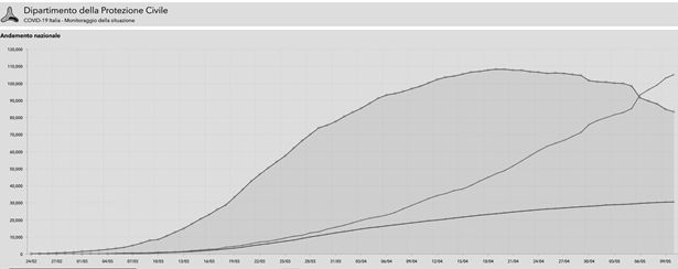
Figure 1 Source of data released by Protezione civile.
As any statistical analysis requires homogeneous and comparable samples, hold the following basic assumptions about the mathematical processing of data:
- The plots of fig 1 implement numbers sufficiently homogeneous to allow the self-consistency of a statistical model throughout the data sampling period. This implies for example that the initial measures of containment of virus infection do not change as a function of time, because this would perturb the natural course of recoveries and deaths with respect to the initial conditions.
- The change of environmental conditions to which the virus seems sensitive, e.g. typically the temperature or the degree of humidity, are not explicitly considered. A deep knowledge of the vitality of the virus and its importance from an epidemiological point of view are certainly essential factors for predicting behaviour and impact on the population. Yet, in lack of pertinent information, these factors and even the ability of the virus to modify itself are neglected.
The data in Figure 1 is the reference standpoint for any subsequent reasoning. In all of the following plots, the graphic symbols signify the respective experimental data, the curves characterise the trend of the mathematical functions aimed to represent them. The overlapping of plots and data is systematically shown throughout this paper to verify the chance of describing correctly the medical assessment via appropriate mathematical functions. This point is not trivial, because in fact the statistical homogeneity of data implemented for calculations is not controllable “a priori”. The statistical parameters of the curves calculated by the statistical software are numbers with several decimal places, omitted or rounded for brevity; it is essential to demonstrate that best fit analytical functions consistent with the observed data effectively exist, whatever the actual computer numerical outputs might be. In other words, the matching between experimental symbols and representative curves rather than the inherent mathematical details is the simplest proof about the reliability of the present calculation model.
The paper consists of two parts
The first one concerns all infection data available up to the time considered in the present paper, with the aim of describing the whole infection event as comprehensively as possible.
The second part repeats some selected calculations considering a few early data only: the aim is to show that actually these initial data are enough to extrapolate reasonably the whole event, thus evidencing that crucial features like peak time and related maximum numbers of infected, recoveries and deaths could have been decently estimated since the beginning of the infection. In fact, the calculations able to reproduce the observed data also provide extrapolated information.
Just that's the main purpose of the model. Three reference books on the standard statistical techniques are reported.1–4 The present calculations have been carried out implementing the “nonlinear fit” statistical packages of MAPLE software. An ample literature has been produced recently to activate medical resources and face urgently the pandemic phenomenon; as expected, the prevalent character of these papers concerns the medical/clinical aspects of the virus problem. See5 as concerns the infection in U.K.6 as concerns virus diagnostics,7 for prevention,8 for implications of infection,9 for transmission from animals to humans and for asymptomatic contacts,10 for infection in Germany.
Among all medical aspects of the Covid 19 infection, the present paper focuses the attention of the reader on the impact of the virus aggressiveness on the population, strictly related to the statistical parameters emerging from the calculations.
Results of the statistical analysis of the trends depicted in the Figure 1
The search for the test function F suitable to represent the observed data of virus spread controlling
among the population must account for some mathematical requirements:
- It must have a maximum as a function of time;
- It must tend to zero for time tending to infinite, otherwise the number of new infections would persist indefinitely, contrarily to what emerges from epidemiological data historically occurred in the past;
- The calculated peak must be later than the first detection date, otherwise F would automatically be incorrect;
- Subsequently, a similar analysis will be also extended to the statistics of deaths and recoveries.
The results of a preliminary data analysis using a Gaussian "bell" type test function, typically used to represent statistical phenomena that fulfil in principle the aforementioned boundary conditions, did not succeed; the initial trend of the Gaussian curve before the maximum increases too slowly to justify the number of
of (Figure 1), which instead have a more drastic exponential growth. For brevity this result is not reported here. A better representative function was instead the following modified Gaussian
, (1)
with
best fit numerical parameters to be found. The problem is just to calculate these constants in order to reproduce and then extrapolate the few initial data available as reliably as possible. The graph in Figure 2 shows the result of nonlinear best fit regression of the representative function (1). Omitting here the mathematical details on the choice of the analytical form of F, shortly sketched below, we emphasize that the time factor
is essential to modify the Gaussian according to the high increasing rate of the early
; this factor is thus representative of the clinical aggressiveness and infectiveness of the virus.
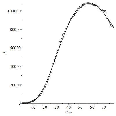
Figure 2 Result of nonlinear best fit regression of the representative function.
It is noted that with this representative function, the agreement with the experimental contagion data is reasonable, while the negative exponential in (1) is actually predictive of
and subsequent descent of the number of contagions as a function of time previously postulated “a priori”.
With this function it is simple to calculate data of interest, summarized in the following eqs (2), which quantitatively account for the calculated peak number of infected persons
and the time
to reach this peak corresponding to
, i.e.:
;
the comparison of
with the observed number of cases
at the day of peak yields
. (2)
The fractional time could mean in principle the reaching of peak time between the 56-th and 57-th day after February 24-th; actually, this result must be intended as a numerical output with mere statistical meaning. What is important is that the deviation between calculated and observed number of infects is satisfactory. The peak number
of infected people is, as of today's date, about 1.4 per thousand of the Italian population with the present data used for the calculations.
Apparently, this calculation seems redundant, once having already visible all experimental values of
before and after the peak. Actually, these results are significant for the comparison with the corresponding extrapolated values of the next section; it will be possible to assess quantitatively the predicting ability of analogous calculations obtained examining a few early data only.
The next plot of (Figure 3) represents in an analogous way the numbers of recoveries and deaths to complete the description of the global infection. The figure is obtained simply with the data corresponding to the days of (Figure 1) via the respective best fit functions, which are respectively
, (3)

Figure 3 Numbers of recoveries and deaths to complete the description of the global infection.
where the capital letters and
are the statistical parameters to calculate explicitly the time trends of
and
. The (Figures 2&3) concern raw observed data, to show the actual chance of representing them via mathematical functions. A further important point to support the validity of the present approach is just the statistical nature of the infection, which appears in fact confirmed defining the function
(4)
plotted in the Figure 4. Assuming that both
and
are consequences of a unique cluster
of infected individuals,
and
are definable as probabilities. The ordinate of the plot reports the joint probability that among
cases of infection there can be both recoveries and deaths, whose respective probabilities are combined according to the law of independent events. Indeed it is reasonable to think that
and
concern in fact independent classes of healthy and unhealthy, smoker and non-smoker individuals of different gender and age, whose immune defences imply different reactions to the infection.
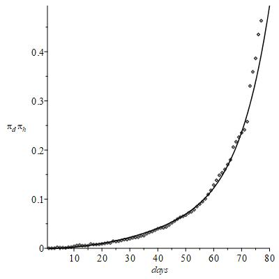
Figure 4 Statistical nature of the infection.
On the one hand it is reasonable to think that
and
depend specifically upon the current clinical anamnesis of individuals with their own past stories, upon sex and all the other variables that contribute to cumulative (Figure 1). So, the collective trends of
and
concern in fact independent classes of healthy and unhealthy people.
On the other hand, from a statistical point of view, in a sample of many subjects the differences from one individual to another appear summarized in a single collective behaviour whose global result is uniquely definable, the one summarized in the figure 1 that is the target of the present paper.
Just the regular trend of this figure encourages thinking that, despite the wide variety of biological parameters triggered by the complex virus/human body interaction, it is anyway possible to identify a well-defined collective behaviour hidden in the apparent randomness of personal situations. The identification of this joint probability is interesting as it concerns the chance of combining the available data to infer more information and deserves a tentative explanation.
Let
indicate an unhealthy patient with small probability
of surviving and thus more likely to die with high probability
, whereas instead
concerns the opposite chance for a healthy patient;
and
add further information to the left hand side of eq (4) because now the probabilities
and
emphasize explicitly the health states of the respective patients. Let the numbers
be large enough to gather individuals that anyway recover at the end of their therapeutic cycle, regardless of whether their initial health conditions are in principle classifiable with both low or high recovering probabilities; a typical example of this idea is that some individuals recover without need of intensive therapy, other ones instead need unfortunately invasive and prolonged hospital treatments but anyway recover. So, the initial
and
are not crucial themselves in determining the final recovery probability
; in other words, different patients classified as
and
merge into a global
defining a unique
. An analogous consideration holds for
regardless of
and
: in fact it is not true that die only individuals in intensive therapy, i.e. the ones classified as
. So when calculating
the respective health conditions represented by the probabilities
and
are statistically equivalent to and simply summarized by
and
of eq (4). As a matter of fact, the respective curve of fig 4 is well defined and thus explainable with
and
described by a unique time behaviour.
Although this conclusion was not strictly evident “a priori”, such a correlation is directly confirmed in Figure 5. The plot shows that the number of recoveries
and deaths
are both functions of time mutually correlated through their common origin from the number of infected
only and thus are in fact uniquely definable: the implicit functions
and
merge together into the function
. (5)

Figure 5 Number of recoveries and deaths.
The regression coefficients at the right of the equation, determined as described above, provide quantitative estimates of the progress of the contagion containment as a function of time.
The trend of
vs
evidences that the numbers of deaths and recoveries are well correlated in the population infected by the virus despite the diversity of the individuals. It is reasonable to guess that during the initial incubation period, soon after the virus attack, the
patients are in a transient state with suspended probabilities
and
before that they turn into either observed state defined by
or
; also here the solid line indicates the existence of a single ideal cumulative probability only, without discriminating serious patients recovered after intensive care or mild patients treated with simple drug therapy. The left-hand side represents the therapeutic efficacy; the different powers of
at the right-hand side concern short term and long-term ratios, when the second addend becomes expectedly predominant. So (5) measures the success of the full therapeutic cycle.
Herd immunity
The statistical model so far described has considered the raw
of (Figure 1) to describe in more detail in Figure 2 the ramp up law of the total number of infected people as a function of time towards to and around the peak. Presumably in this time range no further considerations are necessary besides the obvious requirement of data homogeneous and statistically representative. Yet there is no reason to exclude long term effects, like for example the so called “herd immunity”. While the mere numerical analysis of data does not contain itself epidemiological information, this latter should be hopefully inferred from the former: no statistical model can be considered exhaustive without the ability of extracting information about this protective effect possibly hidden in the raw data. Since the herd immunity is reasonably ineffective in the case of the first initial data but becomes more important subsequently, the second half of the curve in the next (Figure 6) has been drawn cautiously by dashed line; without accounting for herd immunity, in principle this part of the plot estimates only the upper limit of the number of infections. Although the satisfactory matching of raw
observed and calculated curve is good enough to neglect the necessity of corrections, at least with the data presently available, in this section however it is shown how to account for and assess the expected deviation from the long-term data.
In principle realistic values
accounting for the herd effect should be recalculated from the curve of (Figure 6) introducing a corrective factor
at
through iterative calculations until convergence; however it requires hypothesizing an average number of contacts among a selected group of infected and recovered individuals to verify quantitatively the probability of a successful herd protection. In practice the approach to find an expression linking
and
is more simply carried out by introducing a controllable correction factor that modifies reasonably the available short-term results already obtained.
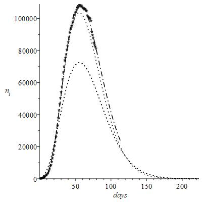
Figure 6 ni observed and calculated curve.
An appropriate strategy to represent mathematically the herd effect is like this
(6)
being C a proportionality constant; i.e.
is reduced by a variable factor which becomes progressively more important with the increase of
itself and with the number
of recoveries.
For
then
, i.e. the herd effect is zero.
If
, then the function (6) is proportional for
to
. That is, if the number of recoveries increases then the number of infected individuals tends to zero, which is precisely what the protective effect of herd protection requires: from a probabilistic point of view, a healthy person surrounded only by recovered people or non-infected people has little chance of becoming infected.
Eq (6) is calculable with
and
extrapolated from the short-term data, where the herd effect is ineffective. Although a heuristic “ab initio” calculation model would be preferable, this equation yields the sought information once more by best fit statistical analysis of long-term infection data. In fact, the approach based on (6) is sensible only if the virus does not change; the early trend summarized by short term data is a fixed fingerprint of a given virus, whereas instead changes merely the long-term probability of infections by contact with recovered neighbours. Yet, if the virus evolves as a function of time, then a unique
curve is no longer representative; it should be replaced by two curves pertinent to the virus before and after modification, i.e. the herd effect is no longer definable via correction of a unique short-term curve. However, the analysis of the long-term curve could in principle provide updated information about the virus modification occurred in the meantime; in this respect it is still sensible to check how the long term curve is modified by the constant coefficient
to infer information about the different short term trend.
An example of simulated results is shown in the Figure 6 with two test values of the constant
purposely chosen, i.e.
and
.
This figure still reports by comparison the data of figure 1 with and without the correction introduced by eq (6); indeed, the main plot is just that of (Figure 2) plus an extrapolated part to be compared with two herd dotted curves. The results with
show
equal to about 35 days, while the maximum peak of infected people
decreases to about 70,000 people infected. It is clear that this value of
foresees a too optimistic herd effect, which should have been already observed experimentally 50 days after February 24; since this is not realistic, the simulation was repeated with
, which in fact foresees the peak at 60 days, with a number of infected equal to about 102.000. As expected, anyway the alteration of the raw data of
is practically zero at
; the differences with respect to Figure 2 begin to become relevant much later only, reasonably at increasing
after the peak. The dot line that represents the long-term extrapolation of the best fit curve of
suggests its tendency to approach that of
. Just this tendency to merge the early curves supports the validity of this reasonable value of
.
It can be concluded that this constant can be either (i) predetermined in order to simulate a herd effect practically negligible initially but progressively increasing with the increase of the infected and of the recoveries or (ii) determined uniquely by the statistical treatment of long term “tail data”.
Early data analysis
This section concerns the results obtainable analysing the first 20 initial data only,
of the fig 1; the notation stands for “reduced” number of early observed data. The Figure 7 shows the result of best fit analysis of these few data only, which of course are insufficient to match decently the true trend of all observed data also reported by comparison. Nonetheless it appears that the peak time is still quite correct, it differs from the true peak time by about one day, whereas the related number of infected is underestimated by about
only. These results show however that the main epidemiological features of virus infection could have been realistically anticipated by a prompt analysis of statistical data. This is the true meaning of the present model.
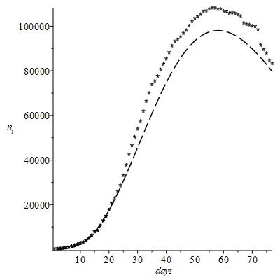
Figure 7 Result of best fit analysis.
The overall indication that emerges from the present statistical model is that even a minimal alteration of environmental data causes a drastic variation in the spread of the virus and its ability of contagion, which is quantified by the best fit parameters of the exponential eq (1). On the one hand, owing to the exponential form, even small changes of these parameters affect strongly the dependence of
upon time. On the other hand, just this mathematical feature describing the contagion suggests that even elementary protection measures preventively actuated, e.g. safety distance between individuals or use of protection masks and so on, are effective in controlling the subsequent epidemic data. This conclusion appears evident in the Figure 6: even small changes of C, purposely introduced in the eq (6) to simulate a typical environmental effect such as herd protection, are enough to modify significantly the long-term evolution of the infection in progress. Also, the fig 2 evidences an anomalous dispersion of data just after the peak, which implies an initial decreasing rate of
slower than predicted by the exponential of (1).
This is not surprising. It is known in general that when a strong effect governs predominantly the kinetic of any process, an external perturbation simply adds a minor spread of data around the leading trend obtainable via statistical considerations only. Instead an equilibrium state in nature is by definition the resultant of many counterbalancing effects, thus particularly sensitive to any external perturbation; specifically, appear around the peak time the possible consequences due to the previous health conditions of the patients and their lifestyle.
Another problem is that the strict measures of restrain initially put in place by the Government authorities have been partially loosened, probably misinterpreting too optimistically the stage after the peak of infected patients as a symptom of reduced danger of contagion. After this short stage, however, the further
data have resumed the behaviour predicted by the eq (1).
It is commonly believed that the turning point of the infection advancement is identifiable with the peak time
of
; undoubtedly this is correct as concerns the effectiveness of the measures to prevent new contagions, but it does not highlight adequately the current state of the epidemic evolution.
Actually, the analysis so far carried out suggests the significance of the relationship between the incoming number
of hospitalized patients and outcoming numbers
and
representing either possible evolution of
after a successful or vain therapy cycle. Yet the experimental data of Figure 1 show the existence of a time such that
, which also implies
; the time evolution of
and
observed at increasing times suggests therefore the relevance of the number
that involves explicitly the effectiveness of the therapies on
patients. Clearly
implies overcrowding of hospitalized patients exceeding the chance of their efficient management;
implies the decreasing rate of new infected patients with respect to their conversion rate to either
or
. If however the growing rate of
decreases until becoming null at the peak time, while in the meantime the sum
continues to increase, then one expects first
at a given
and next even
at
. Hence, assuming that
still evolves at
into
and
, it happens that: (i)
tends to zero while contributing to the growth of
, (ii)
tends towards its final value of total deaths, (iii)
becomes more and more negative.
The (Figure 8) confirms these ideas: it appears that
days after which
indicates a number of new infected
progressively decreasing.
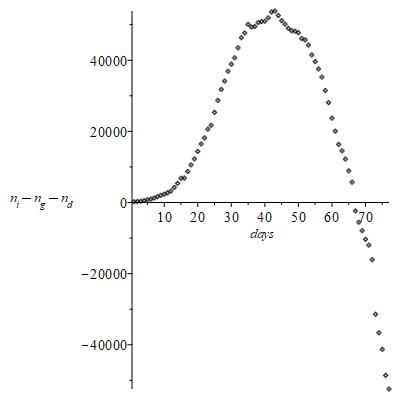
Figure 8 Number of new infected
progressively decreasing.
On the one hand it is not surprising that the time
at which
does not necessarily coincide with
days calculated considering
only. On the other hand it is clear why
and not
is the crucial indicator of the turning-point between the aggressive stage of the virus and its progressive attenuation; when comparing
and
, the sign of
depends upon the relative rates at which the addends prevail each other.
All of this is explained in the Figure 9, showing that in effect
consists of three statistical distributions that end down with negative values; the three contributions of representative best fit functions resolved by the peak analysis are reasonably related to the three respective basic stages of contagion with . The peak splitting equation has the analytical form
(7)
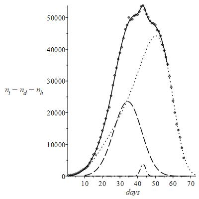
Figure 9 Effect N consists of three statistical distributions.


