eISSN: 2378-315X


Research Article Volume 10 Issue 1
Georgetown University, USA
Correspondence: Othmar W Winkler, Professor Emeritus, Georgetown University, Washington, DC 20057, USA
Received: December 24, 2020 | Published: February 5, 2021
Citation: Winkler OW. A simple graphic method to assess correlation. Biom Biostat Int J. 2021;10(1):1-3. DOI: 10.15406/bbij.2021.10.00324
This study explores the correlation between two variables and to demonstrate a simple graphic method to assess their degree of correlation. Following the lead of early English biometricians, it has been tacitly assumed that the studied variables develop in the same direction: when variable A’s measurements are higher from one object to another, the measurements of variable B, also are higher. The customary measure of co-relation relies on a least squares fitted trend line, then assuming that the trend is more real than, and has priority over the individually recorded data.
The situation changes when measurements of variables develop in opposite directions: The very first data set I used to perform a correlation analysis was a study of student grades achieved and the percentage of their having missed classes: the more a student was absent from class, the lower were his achieved grades. In that situation the accepted model of correlation analysis – the mathematically fitted straight line and the squared distance of each student’s record from that line - was not appropriate.
The usual correlation coefficient contradicted visual evidence of those data because the model underlying that situation treats the individual data as having more reality value than the general trend, but not as deviations or errors. The visual appearance, the graph of that situation, resembles a rectangular triangle, formed by the horizontal and vertical axis as its catheters, and the hypotenuse formed by a line through and representing the highest data points. This image justifies the expression “Triangular correlation”.
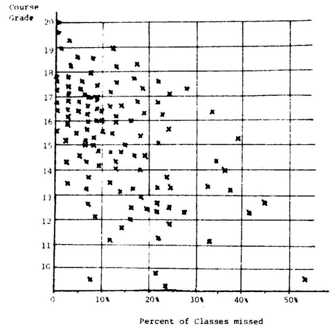
The graph of two-dimensional data from the field of education, grades received and attendance at classes, of 115 observations, resembled a rectangular triangle, formed by the X and Y axes, and a line fitted to the highest data points as the Hypotenuse. Taking advantage of its triangular nature, this study explores a simple way to assess the co-relation between grades and absence from classes yielding an R2=84% a coefficient of triangular correlation compared to the standard measure of association, yielding the very different correlation coefficient r² of only 17.5%. Obviously the linear regression-correlation model was not appropriate for these data. The proposed simpler method treats each data point as the factual reality, not as a deviation from a hypothesized ideal regression line. Given that the data were in the shape of a rectangular triangle, to assess the degree of association, between the two characteristics of the data allowed taking advantage of the geometry of rectangular triangles.
The diagram in Figure 1 shows the semester grades of the students in the courses “Economic Statistics” and their attendance at classes. As expected, the data show a relationship between the students’ academic success and their attendance at the class lectures. In fact the data form a rectangular triangle with the X and Y coordinates as its catheters, a line through the highest data points, the hypotenuse. Class attendance appeared as a condition but not as a guarantee for good grades. Absence from classes was an obvious impediment. The historically unique circumstances of this study, however, should forewarn against generalizing the results of this study. Statistically speaking, the 115 data points in Figure 1 are a population, not a sample. The X and Y components of these data, the academic performance and class attendance of each student, like in most socio- economic statistical studies, though not of the precision customary in biometric and science research, were carefully recorded and trustworthy. If “Errors of measurement” in these carefully kept records of the class attendance and the academic performance of these students should have occurred, they were not in the classical shape of the Gaussian error curve.

Figure 1 Course grade obtained and percentage of classes missed – courses given by Prof. O. Winkler –records of his 115 students taking Economic Statistics and other quantitative subjects during 1948-50; Facultad de Sciencias Económicas y Sociales, Universidad Central de Venezuela, Caracas.
The linear statistical regression/correlation analysis – ‘regression’ named for the discovery that the heights of sons “regressed’’ to the height of their fathers revealing its origin in biometry - of the complete set of these data was Ý (Y-hat) =16.682885–0.069214 X course grade on the Y-axis, and ‘Percent of classes and lectures missed’ on the X-axis. Although this equation follows the ‘sweep’ of the data, the coefficient of correlation of this data set, r=-0.4182294 and it’s r2=0.1749198% was out of character, indicating that there supposedly was only a small measurable relationship of 17.5% between grade obtained and classes missed by these students. The visual inspection of that graph, however, conveyed a stronger relationship!
An unexpectedly small correlation. Lower grades in that group apparently were more determined by other factors, like lack of interest in the subject, insufficient background in mathematics acquired in High School, personal difficulties with human relations, etc. But the visual inspection of Figure 1 appears to tell a different story!3
Proposal of a simpler, faster alternative method
The scattered values, Figure 1, appear concentrated on the left upper side, spreading and thinning out toward the lower right as a heteroscedasticity. With some imagination one can envision this scatter plot as shaped like a rectangular triangle: the X and Y Axes as the two catheters’ and the still to be drawn ceiling line as the hypotenuse. To draw that hypotenuse attention is to be given only to the highest data points that correspond to the X-value of each data point. I decided to also include the data point with an x=5% even though it was quite low and seemed part of the “data crowd”, not of the intended ceiling line. Yet as this point was the relatively highest, I included it in the ceiling line to be established. I continued marking (e.g. circling) the other 24 such relatively highest points. Then with a straight- edge ruler drew visually, “by hand or by eyeball” what a least square technique would have accomplished. That line intersected the Y axis at 19.6, and the X axis at 65%. Depending on the careful selection of these points and the best estimate of the best fitting line, the resulting hypotenuse, drawn by different statisticians, may be the slant and intersection of that hypotenuse with the abscissas. The computed least-square fitted straight line of these 25 highest data was Y=19.6-0.16 X.
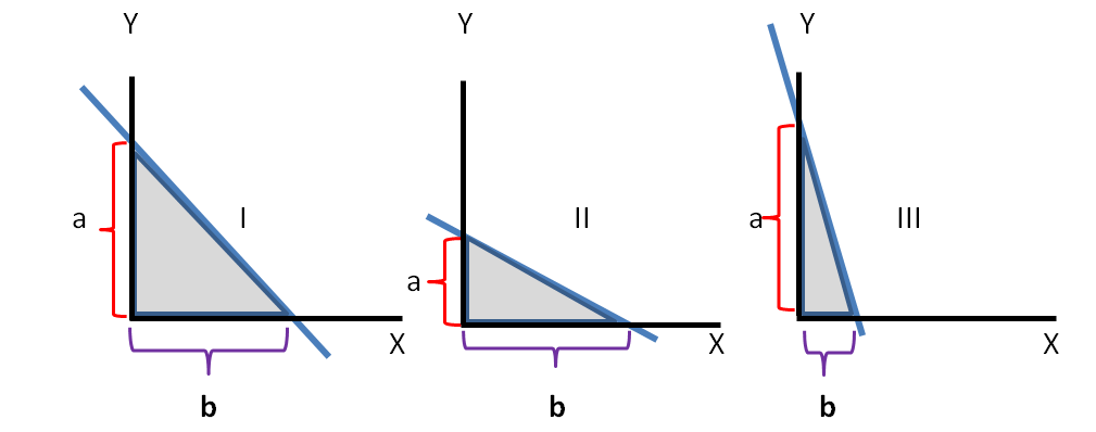
The three possible situations, shown in Figure 2, explain the next step. If the hypotenuse, the line through the 25 highest data, the first of the three drawings, Figure 2 I is at a 45 degree angle and segments ‘a’ and ‘b’ are equal, then the - not shown - data points inside that shaded triangle are probably optimally distributed with a (very) close association and interaction of their two variables. The ratio between the two catheters a/b=1. The two other drawings present alternative situations: where a<b, such a slant of the hypotenuse indicates a reduced association between two variables, and a/b<1 Figure 2 II In the limit ‘a’ approaches the value 0 and that inequality, tending toward infinity, becomes the Frequency Distribution of the single remaining variable b, plotted on the X–scale. Something analogous happens when a/b>1 as in the third drawing, Figure 2 III. In that case the x-values of the data points of variable ‘a’ are closely “squeezed,” resulting in only a reduced, small influence of the variable ‘b’ of these originally two-dimensional data. That ratio of a/b is a (relatively) quick way to assess the strength of the interaction of variables. In the example of this study, the grades for the learning success and corresponding attendance at lectures, the new proposed method, reveals (so I hope) the strength of that relationship without spending – or wasting – much time on calculations.

Figure 2 Schema of the effect of the inclination of the hypotenuse on the catheders of the triangle. Three typical alternative situations show the effect on both catheders, carrying the two characteristics or variables in all data (not shown in graph).
Before applying this simple procedure, the variables on the X-scale and that on the Y-scale need to be expressed in a common measure. Simple in this case: the data on the horizontal scale were already expressed as %, starting with 0%. The data on the vertical axis, from 9 to 20, had to be converted to percentages, dividing every entry on that scale by 20 and multiplying by 100 making the scales of ‘a’ and that of ‘b’ compatible. In this data set: the size of the recalibrated scale for ‘a’ extends from 45% to 98%, a width of 53%; similarly b=63% - 0, a scale width of 63%. a/b =53/63=0.84126698.
The final conclusion: Student grades and class attendance–according to this “quick and dirty procedure” was correlated like 84%.44
This topic is not yet finished. To assess the confidence the proposed short-cut procedure deserves – judging the co-relation of two variables for an entire group by relying only on its high outliers that are not even a representative sample, instead of using all available data-the realism of the different philosophic foundations of these two procedures will have to be carefully considered. The reliability and truth value of the proposed procedure, treating the entire data set as one block or unit, instead of using all data points as separate entities, is to be compared with the standard r² coefficient of correlation, computed of all the individual data points. The proposed procedure, in contrast yielded an estimate of the correlation of grade received and absence from classes of R2=84%. To study/justify the result of this short-cut “quick and dirty” procedure against the established and respected procedures would be a worthwhile contribution to this area of statistics. The foregoing discussion that appeared only of academic, not of practical value actually could have many applications because many data sets could be converted to triangles becoming amenable to the proposed shortcut procedure.
1This study of a simple, quick, graphic procedure, is based on data described in “chapter 9.4 “Different Forms of Data Association in the Social Sciences” in the Springer publication “Interpreting Economic and Social Data – A Foundation of Descriptive Statistics,” 2009, by this author.
2It was the first so named course in 1949 in the newly established Departamento Economia de la Universidad Central de Venezuela, Caracas, also one of the first teaching experience of this author. The scatter diagram shows the course grade and the recorded absence from class of each student. At that time success in mastering the material covered by lectures in class, was not given the customary letter grades A – F but was graded on a 20 point system. Ratings below 10 indicated failing the course. At that time regular attendance at class lectures was more important because textbooks on Economic Statistics in Spanish were not available and students had to rely on their own class notes or those of colleagues
3Up to this point the example and treatment followed essentially the paper “On Triangular Correlation” Othmar W. Winkler, 1980 Business and Economics Statistics Section. Proceedings of the American Statistical Association
4The developments in a later re-treatment of this topic went a different route. In “Interpreting Economic and Social Data – A Foundation of Descriptive Statistics” ‘9.4 Different Forms of Data Association in the Social Sciences’ p.175-180, O.W. Winkler, Springer, 2009

©2021 Winkler. This is an open access article distributed under the terms of the, which permits unrestricted use, distribution, and build upon your work non-commercially.
2 7